
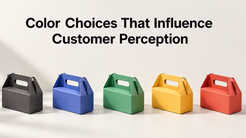
Imagine walking into a supermarket looking for coffee. You are not reading labels yet. Instead, your eyes instinctively land on one particular package sitting among dozens of competitors. Maybe it’s wrapped in deep matte black that feels premium, or perhaps it’s covered in warm earthy tones that suggest authenticity. Before you even know the price, the ingredients, or the story behind the brand, your brain has already formed an opinion. This silent conversation between colors and human psychology is exactly why every graphic design company pays close attention to color decisions. Whether it is a logo, a product package, or a digital storefront, colors shape first impressions faster than words ever can.
People often believe they make purchasing decisions based on logic, but research consistently shows that emotions play a much larger role than we realize. Colors influence how trustworthy a brand feels, how luxurious it appears, whether it seems energetic or calming, and even whether customers remember it days later. While products can be copied and prices can be matched, creating an emotional response through color is much harder to replicate. This makes color one of the most valuable branding tools available to businesses of every size.
Your Brain Judges Color Before It Reads Words
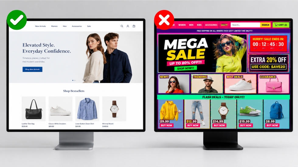
Think about the last time you downloaded an app or visited a new online store. Within seconds, you probably decided whether the brand looked professional or unreliable without reading much of the content. That reaction came largely from visual design, and color played a major role.
The human brain processes visual information incredibly quickly. Long before someone notices a headline or reads a product description, they have already absorbed the overall mood created by the color palette. Bright colors can generate excitement, muted shades often communicate sophistication, and natural greens may suggest sustainability or wellness. These reactions happen almost instantly because our brains naturally associate colors with experiences we’ve collected throughout our lives.
This is one reason why successful website design focuses on creating a consistent visual experience rather than choosing colors simply because they look attractive. Every color should reinforce the personality a brand wants customers to remember.
Every Color Tells A Different Story
Colors are much more than decoration. They communicate messages that customers interpret almost automatically.
Blue is commonly associated with trust, stability, and reliability, which explains why many banks and technology companies use it. Red creates urgency, passion, and excitement, making it popular for restaurants, clearance sales, and sports brands. Green often represents nature, health, growth, and sustainability, while black is frequently linked with luxury, exclusivity, and sophistication.
However, context matters just as much as the color itself. A luxury perfume wrapped in bright neon colors may confuse customers, while a children’s toy packaged entirely in black might feel too serious. The most effective brands choose colors that match both their audience and the emotions they want people to experience.
Packaging Often Speaks Before The Product Does
Imagine receiving two identical products delivered to your doorstep. One arrives in a plain brown box with a basic label, while the other comes in beautifully designed packaging with carefully selected colors that match the brand’s personality. Even before opening the package, most people would assume the second product is higher quality.
This is why packaging design has become such an important investment for modern businesses. Customers frequently share attractive packaging on social media, remember products because of distinctive colors, and even recommend brands based on the overall unboxing experience. Great packaging transforms an ordinary purchase into something memorable, helping brands stay in customers’ minds long after the product has been used.
Why Color Consistency Builds Trust
Imagine if your favorite coffee shop suddenly changed its logo from green to bright orange, redesigned its website in purple, and introduced product packaging in yellow. Even if the coffee tasted exactly the same, the brand would feel unfamiliar.
Consistency creates recognition, and recognition builds trust. When customers repeatedly see the same colors across advertisements, packaging, websites, and social media, they begin associating those colors with the brand itself. Eventually, they no longer need to read the company name because the visual identity becomes instantly recognizable.
This is why businesses invest significant time in logo design before launching their products. A carefully chosen color palette becomes the foundation for every future marketing effort, creating familiarity that strengthens customer confidence over time.
Different Industries Need Different Color Strategies
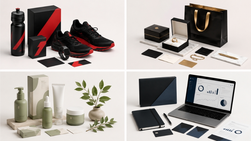
There is no universal color palette that works for every business. A fitness brand trying to motivate customers requires a completely different visual identity than a luxury jewelry company or a skincare brand.
For example, energetic brands often use bold colors that communicate movement and enthusiasm, while wellness companies usually prefer softer, calming tones that promote relaxation and trust. Food brands may choose warm colors that stimulate appetite, whereas financial companies often rely on blues and neutral shades to communicate security.
Successful branding comes from understanding customer expectations rather than following trends. Choosing colors simply because they are fashionable can quickly make a brand feel outdated once trends change.
The Growing Importance Of Color In D2C Brands
Direct-to-consumer businesses face a unique challenge because customers usually discover them online before ever seeing the product in person. Every digital interaction has to create confidence immediately.
Strong D2C Branding relies heavily on color because customers cannot physically touch or experience products during their first interaction. From Instagram advertisements to product pages and email campaigns, consistent colors help create familiarity across every customer touchpoint. When those customers finally receive their order, the packaging should reinforce the same visual identity they experienced online.
This is exactly why thoughtful D2C packaging design has become a competitive advantage rather than just a finishing touch. A consistent experience from digital discovery to physical delivery strengthens customer loyalty and increases the likelihood of repeat purchases.
Color Trends Come And Go, Psychology Lasts
Every year brings new design trends. One season earthy tones dominate, while another embraces vibrant gradients or pastel shades. Although trends can inspire fresh ideas, brands should be cautious about redesigning their entire identity simply to stay fashionable.
Customer psychology changes far more slowly than design trends. Colors associated with trust, excitement, luxury, or sustainability continue to influence buying behavior regardless of what is currently popular. Brands that balance timeless psychology with modern aesthetics usually create identities that remain effective for many years.
Experienced designers understand that successful branding is not about choosing trendy colors. It is about selecting colors that continue telling the same story every time a customer encounters the brand.
Choosing Colors Is More Strategic Than Most Businesses Realize
Many businesses begin branding by asking which colors they personally like. A more effective question is how they want customers to feel. Should the brand appear premium? Friendly? Innovative? Reliable? Sustainable? Once those emotional goals are clear, color choices become much easier and far more meaningful.
This strategic approach is why businesses often partner with a professional packaging design company instead of making visual decisions based on personal preference alone. Designers combine psychology, industry research, customer expectations, and creative thinking to develop color systems that support long-term brand growth rather than temporary visual appeal.
Colors quietly shape nearly every buying decision we make. They influence first impressions, build trust, communicate quality, and create emotional connections that customers often cannot explain. While products and services remain essential, the colors surrounding those offerings determine how people perceive them before they experience them.
Businesses that treat color as a strategic branding tool rather than a decorative element are more likely to create memorable experiences across their logo, packaging, website, and marketing materials. When every color reflects the brand’s personality and speaks consistently across every customer touchpoint, customers are not just buying a product. They are buying the feeling the brand creates.
