
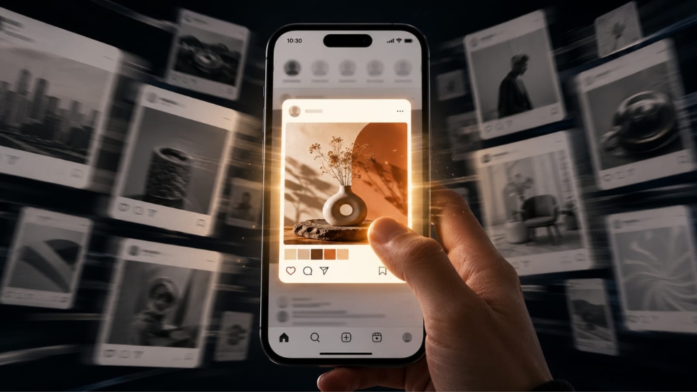
A graphic design company quickly learns that earning someone’s attention has become one of the hardest challenges in modern marketing. Imagine unlocking your phone and opening Instagram, LinkedIn, or Pinterest. Within a minute, you’ve already scrolled past dozens of posts without consciously thinking about them. Some disappear almost instantly, while others somehow make your thumb pause. You don’t always know why you stopped, but something about the visual interrupted your routine. That brief pause is incredibly valuable because, in today’s digital world, attention is often the first step toward trust, engagement, and eventually a purchase.
Many people assume scroll-stopping visuals are created through flashy effects, loud colors, or complicated graphics. While those elements may grab attention for a moment, they rarely hold it. The visuals that consistently perform well usually rely on something much deeper. They guide the viewer’s eye, communicate an idea immediately, and make people curious enough to stay for another few seconds. Those extra seconds often determine whether someone becomes a customer or simply continues scrolling.
It Starts With One Clear Message
Imagine seeing a billboard while driving down a busy road. You only have a few seconds to understand what it’s trying to communicate before it’s gone. Social media works exactly the same way. People aren’t studying every design. They’re scanning quickly, looking for something that immediately feels relevant or interesting.
Professional designers understand this, which is why they rarely try to communicate five different ideas in one visual. Instead, they focus on a single message that can be understood almost instantly. Whether it’s promoting a product, sharing a statistic, or introducing a brand story, clarity always wins over complexity. When viewers don’t have to work to understand a design, they’re far more likely to stop and engage with it.
Your Eyes Need Somewhere to Land
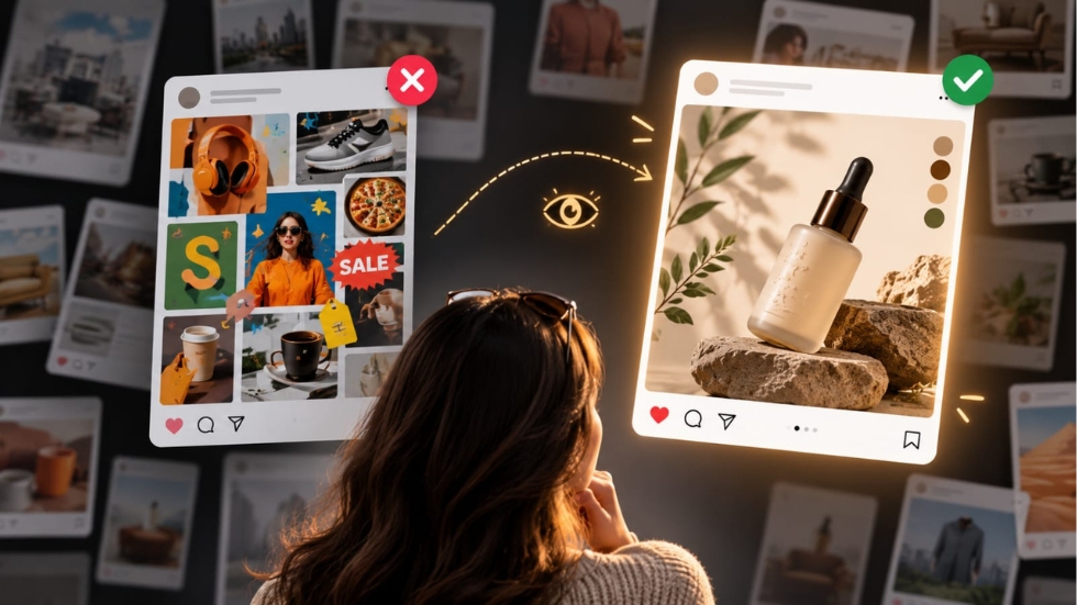
Think about walking into a room where everyone is talking at the same time. After a few moments, everything blends together, making it difficult to focus on any single conversation. Visuals can create the same feeling when every element competes equally for attention.
Scroll-stopping designs guide the viewer instead of overwhelming them. They establish a clear focal point, use contrast intentionally, and create a visual hierarchy that naturally leads the eye from one element to another. Large headlines, thoughtful spacing, and balanced compositions all contribute to making information easier to process. This same principle applies to website design, where visitors should immediately understand what deserves their attention without feeling lost or distracted.
Simplicity Is More Powerful Than Decoration
One common misconception is that impressive visuals require dozens of effects, textures, gradients, and animations. In reality, many of the strongest designs succeed because they remove unnecessary distractions rather than adding more elements.
Professional designers often spend more time deciding what to remove than what to include. Every icon, photograph, color, and line should support the main message. If something doesn’t improve communication, it usually doesn’t belong. This disciplined approach allows the most important information to stand out instead of competing with decorative details.
Simple doesn’t mean boring. It means purposeful.
Colors Influence the First Impression
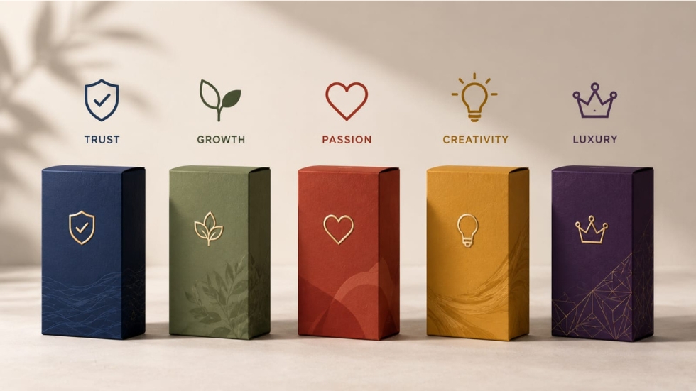
Long before someone reads a headline, they react emotionally to color. Without realizing it, viewers begin forming assumptions about professionalism, excitement, trust, or luxury based on the palette they’re seeing.
Experienced designers choose colors strategically instead of selecting personal favorites. The right palette supports the message while strengthening the overall personality of the brand. A memorable logo design follows the same principle because its colors become part of how customers recognize and remember the business. Consistency across every visual helps audiences develop familiarity over time, making future content easier to recognize while scrolling.
Also Read: Color Choices That Influence Customer Perception
Great Visuals Tell Stories Without Words
Have you ever looked at an advertisement and immediately understood what it was trying to say before reading a single sentence? That’s the power of visual storytelling.
Instead of relying entirely on text, strong visuals use composition, imagery, lighting, perspective, and emotion to communicate ideas instantly. A carefully chosen photograph, a creative illustration, or even the placement of everyday objects can tell a story that captions simply reinforce. This approach encourages curiosity because viewers naturally want to understand what’s happening before they continue scrolling.
The most memorable visuals rarely explain everything immediately. They invite people to discover the message for themselves.
Consistency Makes Content Instantly Recognizable
Many businesses focus entirely on making individual posts attractive. Professionals think much bigger than that. They create visual systems where every piece of content feels connected.
Typography, spacing, photography style, colors, and layouts remain consistent from one post to the next. Over time, audiences begin recognizing the content before they even notice the company name. This consistency plays a significant role in D2C Branding, where customers often discover brands through repeated digital interactions long before making a purchase. Recognition doesn’t happen because one design goes viral. It happens because hundreds of visuals quietly reinforce the same identity.
Packaging Can Stop the Scroll Too
Scroll-stopping visuals aren’t limited to social media graphics. Product photography plays an equally important role, especially for businesses selling physical products online.
Thoughtful packaging design can instantly communicate quality before customers ever experience what’s inside the box. A premium presentation photographed in a clean, compelling way often captures attention much faster than generic product images. This is one reason experienced designers work closely with businesses to ensure the packaging itself becomes part of the marketing rather than simply a protective container.
Great visuals begin with great products presented thoughtfully.
Every Detail Contributes to Attention
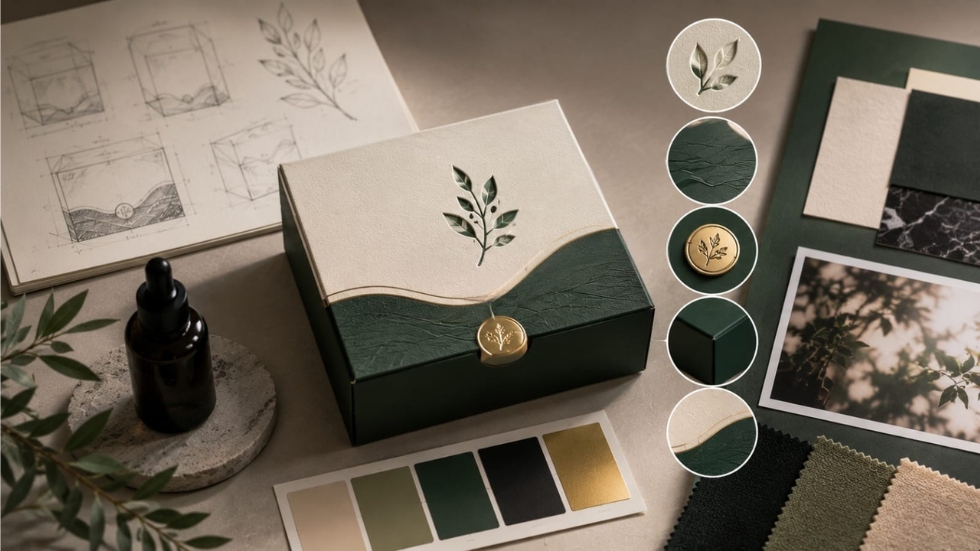
Many people believe viewers notice only the headline or the main image. In reality, attention is shaped by dozens of small details working together.
Spacing influences readability. Shadows create depth. Typography affects emotion. Alignment improves clarity. Image quality communicates professionalism. Even subtle adjustments that most people never consciously notice contribute to whether a visual feels polished or forgettable. A skilled packaging design company applies this same level of attention across every project because customers often judge quality through presentation before interacting with the product itself.
Professional-looking content is rarely the result of one brilliant decision. It’s the result of hundreds of careful ones.
Attention Is Earned, Not Demanded
Some brands try to stop the scroll by shouting louder than everyone else. They use oversized text, excessive colors, flashing animations, or sensational headlines. While these techniques may attract temporary attention, they don’t always build trust.
The most effective visuals earn attention by providing value. They educate, inspire, entertain, or solve a problem. They respect the viewer’s time instead of competing aggressively for it. When people consistently associate your content with useful or interesting experiences, stopping to view your next post becomes a habit rather than an accident.
Strong Visuals Continue Beyond Social Media
Creating an attractive social media graphic is only one part of the customer journey. Once someone clicks through, the experience should remain just as polished.
If the advertisement looks premium but the website feels outdated, or if the product arrives in plain packaging that doesn’t reflect the online experience, trust quickly disappears. Businesses investing in D2C packaging design understand that every customer touchpoint should reinforce the same visual identity. The scroll may have started the relationship, but consistency is what keeps it going.
Scroll-stopping visuals aren’t created through luck or flashy effects. They’re built through thoughtful design decisions that prioritize clarity, storytelling, consistency, and customer experience. The strongest visuals don’t interrupt people because they’re loud. They interrupt people because they’re meaningful.
Whether you’re creating social media content, designing product packaging, or developing a complete brand identity, every visual should have a clear purpose. When design communicates quickly, feels consistent, and tells an authentic story, people naturally pause to pay attention. In a world where attention disappears in seconds, those thoughtful design habits often become one of the most valuable competitive advantages a business can have.
