
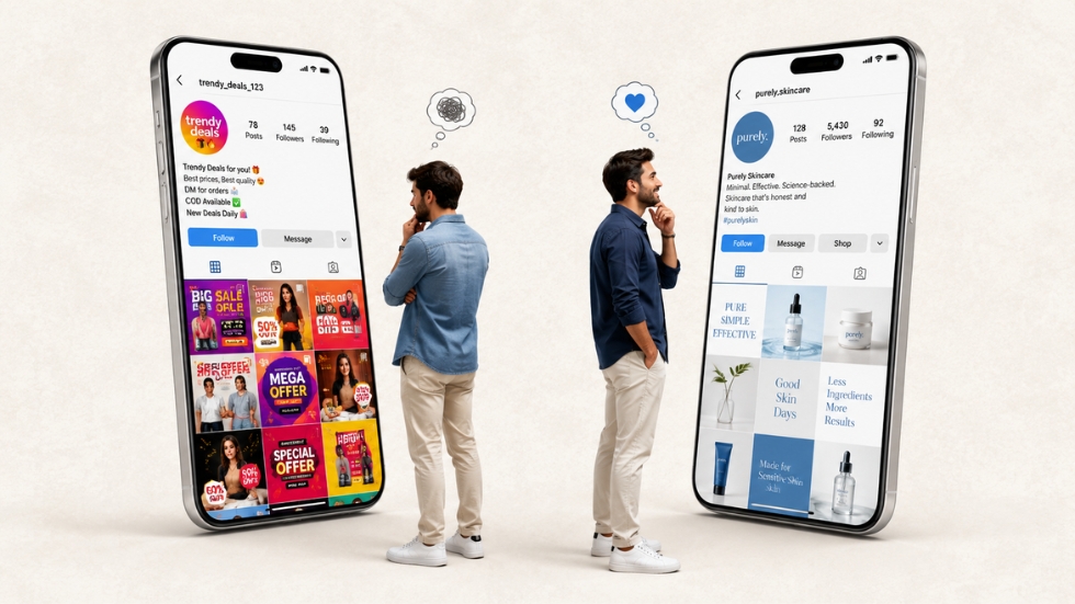
You can usually tell when a business has rushed a social media post. The logo is squeezed into a corner, five different fonts are competing for attention, the text is sitting awkwardly over an image, and somehow there are three different shades of the same color. A graphic design company would probably spot these problems within seconds, but business owners often don’t notice them because they are focused on getting the post published rather than examining how the design actually feels.
That is understandable. Social media moves quickly, and businesses are constantly expected to produce something new. But speed shouldn’t mean throwing basic design principles out of the window. A social media graphic is often one of the first things someone sees when they encounter a business online, so small design mistakes can quietly make the entire brand look less professional.
The frustrating part is that most of these mistakes are completely avoidable. You don’t need complicated design software or an expensive creative team to understand them. You simply need to know what makes a graphic feel intentional instead of thrown together.
Trying to Say Everything in One Post
One of the most common mistakes happens before the design even begins. A business has a promotion, an announcement, a product feature, a list of benefits, a website link, contact information, and three other things they want customers to know. So all of it gets pushed into one graphic.
The result is usually crowded and difficult to understand. The viewer has to read several lines of text before figuring out what the post is actually about. Social media users rarely give a complicated graphic that much attention. If the main message isn’t obvious within a few seconds, they will probably keep scrolling.
A better approach is to decide what the one most important message is before opening the design software. Everything else should support that message or move into the caption. A post doesn’t become more valuable simply because it contains more information.
Using Too Many Fonts
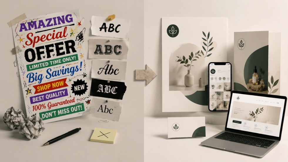
Changing fonts can feel like an easy way to make a design more interesting. One font for the headline, another for the subtitle, something decorative for emphasis, and perhaps another one for the small details. Before long, the graphic starts looking less like a brand and more like several different designs placed on top of each other.
Typography needs some discipline. Two well-chosen fonts can create plenty of contrast when they’re used properly. The difference can come from size, weight, spacing, or placement rather than constantly introducing another typeface.
This is especially important for businesses that are trying to build recognition. The typography used in social media should feel connected to the wider identity, just as it does across website design, brochures, advertisements, and other brand materials.
Making Everything the Same Size
There is another problem that often appears when businesses are afraid of leaving anything out. Every piece of information gets roughly the same visual importance.
The headline is the same size as the supporting text. The product name competes with the price. The CTA is no different from the disclaimer. The logo is given the same attention as the main message. When everything is equally loud, the viewer has no idea where to start.
Good design creates an order. Something should catch the eye first, something else should explain it, and another element can provide additional information. This visual hierarchy helps people understand the post without having to consciously work through it.
Also Read: The Role of Visual Hierarchy in Better Design
Treating the Logo Like the Main Attraction
Businesses understandably want people to remember their logo, but making it enormous isn’t necessarily the best way to achieve that.
A logo that takes up a large portion of a social media graphic can make the design feel promotional in the wrong way. Instead of noticing the actual message or product, viewers notice that the brand is trying very hard to be noticed.
Your logo should be visible and recognizable, but it doesn’t need to dominate every composition. Strong logo design works partly because it can remain recognizable without taking over the entire visual. Give the content room to communicate while allowing the brand identity to support it.
Also Read: Your Brand Is More Than a Logo: Here’s What You’re Missing
Choosing Images Without Considering the Design
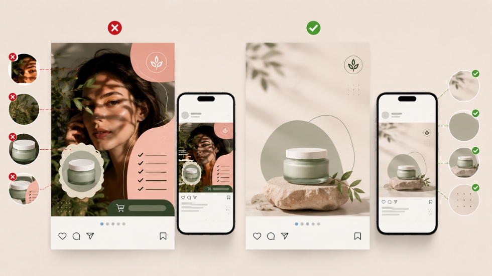
Sometimes the problem isn’t the graphic itself. It’s the image being used.
A photograph may be beautiful on its own but completely unsuitable for the layout. There might be someone’s face directly behind where the headline needs to go, important product details may be cropped, or the background may be so busy that text becomes difficult to read.
Good social media design starts with choosing imagery that works with the message. Consider where the text will sit, how the image will be cropped, what will appear on mobile screens, and whether the subject has enough breathing room.
The same thinking applies to packaging design. A strong visual isn’t simply attractive. It needs to work within the space and support the information around it.
Adding Effects Just Because You Can
Drop shadows, gradients, outlines, glow effects, strokes, reflections, 3D text, and animations can all be useful. The problem starts when every available effect appears in the same post.
Effects should solve a visual problem, not exist simply because the software makes them possible. A subtle shadow can separate text from an image. A restrained gradient can improve readability. A simple overlay can create contrast.
When every element has a glow, shadow, outline, or special treatment, nothing feels special anymore. The design becomes visually noisy, and the message gets buried underneath the decoration.
Ignoring Spacing
One of the easiest ways to make a design feel amateur is to push everything too close together.
Text sits against the edge. The headline is almost touching the image. The CTA is squeezed underneath the paragraph. The logo is barely separated from another element. Nothing technically looks “wrong,” but the entire graphic feels uncomfortable.
Spacing gives elements room to exist. It also helps separate different pieces of information so the viewer can understand the structure of the design. You don’t need to fill every empty area. Sometimes the space you leave behind is what makes the important elements stand out.
Professional design often looks simpler because it isn’t trying to use every available inch.
Ignoring Mobile Viewing
A design can look perfectly fine on a large computer monitor and become almost impossible to read on a phone.
This happens frequently when businesses use small text, detailed graphics, thin fonts, or complicated layouts. Social media is primarily experienced through small screens, so the design needs to survive that environment.
Before publishing, look at the graphic at the size an actual viewer will see it. Can you immediately understand the headline? Is the product recognizable? Can you read the supporting text without zooming in? If not, the design needs another round of editing.
Designing for the platform isn’t an optional final step. It’s part of the design itself.
Using Brand Colors Without Understanding Them
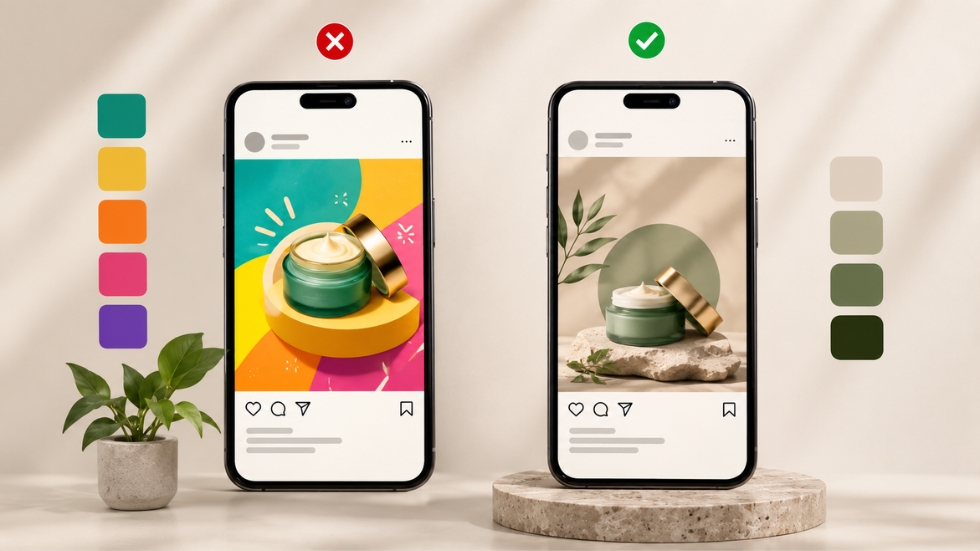
Having brand colors doesn’t mean every social media graphic needs to contain every color.
A business might have five colors in its identity and try to use all five in every post. The result can become unnecessarily busy. Brand colors are meant to create recognition, not restrict every design to the same combination.
Use the palette strategically. Sometimes one primary color with a neutral background will be stronger than using the entire palette at once. A restrained approach can actually make the brand feel more confident.
This becomes particularly important for businesses working on D2C branding, where the same identity needs to appear across social media, websites, advertisements, and physical customer experiences.
Copying Trends Too Literally
A design trend starts appearing everywhere. Suddenly every business wants the same layout, the same typography, the same collage effect, or the same visual treatment.
Trends can be useful for understanding what audiences are responding to, but blindly copying them can make a brand look interchangeable. What works for a fashion creator may not work for a financial company. What looks appropriate for a playful food brand may feel completely wrong for a professional service business.
The goal isn’t to avoid trends altogether. It’s to adapt them to your own identity rather than allowing the trend to become your identity.
Forgetting That the Design Represents the Business
This is perhaps the biggest mistake of all. Businesses sometimes treat social media graphics as disposable content because they are only going to appear in a feed for a short period.
But customers don’t necessarily see them that way.
Someone discovering your business for the first time may scroll through several of your posts before deciding whether you seem credible. If every graphic uses different fonts, colors, layouts, and imagery, the inconsistency starts affecting their perception of the business itself.
Your social media presence should feel like part of the same company customers encounter everywhere else. If your packaging looks premium, your website feels polished, and your social media graphics look rushed, the disconnect becomes noticeable.
Good Design Is Often About Knowing What to Remove
Professional-looking graphics aren’t necessarily the ones with the most creative elements. Often, they’re the ones where someone had the confidence to remove what wasn’t needed.
Take away the extra font. Remove the unnecessary icon. Reduce the amount of text. Give the headline more space. Simplify the color palette. Let the image do some of the work.
That editing process can be harder than adding things because it requires deciding what actually matters. But once unnecessary elements disappear, the message usually becomes clearer and the design starts feeling more intentional.
A professional social media graphic doesn’t need to be complicated, expensive, or filled with impressive effects. It needs to be clear, purposeful, readable, and connected to the brand behind it.
The best designs usually come from making a series of small decisions correctly. Choosing the right image, limiting typography, creating hierarchy, using space properly, keeping the branding consistent, and designing for the actual platform can completely change how a post feels.
Most importantly, remember that social media graphics aren’t separate from your brand. They are part of the experience customers use to decide whether your business looks trustworthy, relevant, and worth paying attention to. When the design feels intentional, the business often feels more intentional too.
