
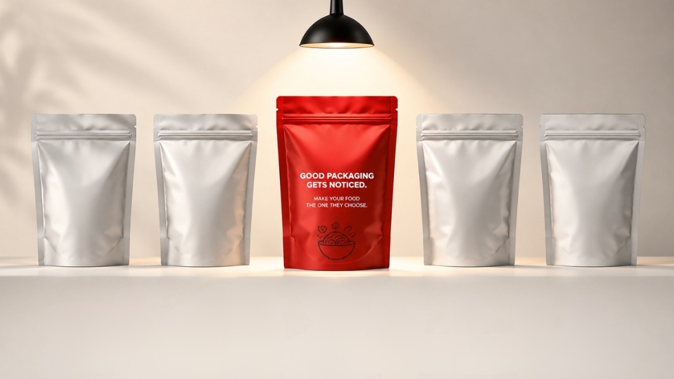
You’re standing in a supermarket aisle looking for something simple. Maybe it’s a bag of chips, a box of cereal, a jar of pasta sauce, or a snack you’ve never tried before. There are dozens of options in front of you, most offering roughly the same thing. You didn’t come prepared to study every ingredient, compare every claim, or research each brand. Your eyes move across the shelf, and within a few seconds, one product makes you pause.
That moment is where packaging design does some of its most important work. Before the taste, texture, or quality of the food can speak for itself, the package has to earn attention. It has to compete with neighboring products, communicate what it contains, and create enough interest to make someone reach for it. In a crowded food aisle, being good isn’t enough if nobody notices you in the first place.
But standing out doesn’t simply mean using the brightest color or the biggest product name. In fact, some of the most effective food packaging does the opposite. It understands what the customer is looking for and gives them a reason to stop.
The Shelf Is a Very Competitive Place
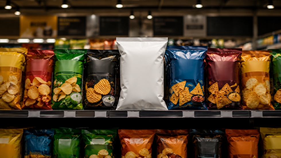
Food packaging is rarely seen in isolation. A designer might spend hours looking at a package on a clean white screen, but customers usually see it surrounded by competitors. A cereal box sits between other cereal boxes. A bottle of sauce is one of twenty bottles on the same shelf. A snack package competes with dozens of other colors, shapes, and claims.
That changes the way packaging needs to be designed.
A product can look beautiful on its own and completely disappear when placed in a real retail environment. This is why experienced designers consider the shelf before finalizing a design. What colors are competitors using? How crowded is the category? What information appears repeatedly across every package? Sometimes standing out means being bold. Other times, it means being noticeably simpler than everything around it.
The context matters just as much as the design itself.
People Want to Know What They’re Buying
There is one problem with food packaging that doesn’t exist in quite the same way for every other product category. People are going to eat what’s inside.
That means curiosity is useful, but confusion can be dangerous.
A beautifully designed package that leaves customers wondering what the product actually is may get attention but lose the sale. Good food packaging creates interest while still communicating the essentials quickly. Is it sweet or savory? Is it spicy? Is it organic? Is it a snack, a drink, a sauce, or a meal ingredient? The customer shouldn’t have to investigate the entire package to find out.
This is where visual hierarchy becomes important. The product name, food imagery, flavor, and key information all need different levels of attention. A strong design helps the customer understand the product almost immediately while still giving them something interesting to discover when they look closer.
Also Read: Packaging Design Through the Eyes of a Customer
Color Can Make Food Feel Different
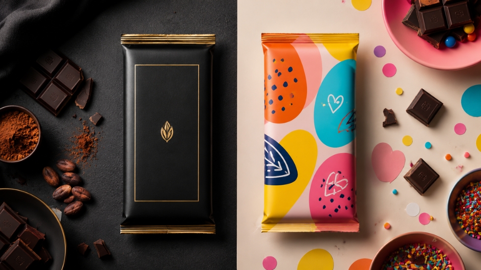
Imagine two identical chocolate bars. One is wrapped in deep black with minimal gold details. The other uses bright colors, playful illustrations, and oversized typography. Before tasting either one, you would probably expect a different experience from each.
Color shapes expectations.
Warm colors can make packaging feel energetic, indulgent, or bold. Natural greens and earthy tones may suggest freshness or ingredients associated with nature. Softer colors can create a calmer or more premium feeling depending on how they’re used. There is no single color that guarantees success. What matters is whether the visual choices support what the product wants customers to feel.
The mistake is assuming that food packaging needs to be loud to compete. Sometimes a carefully controlled color palette can create more impact than a package trying to use every color available.
The Food Itself Can Become the Hero
When customers cannot taste or smell a product before buying it, imagery can help them imagine the experience.
A close-up photograph of melting chocolate, crispy chips, fresh fruit, or steaming pasta can create an immediate reaction. It can make the product feel more appealing and help customers understand what they’re getting. But food imagery has to earn its place. A generic image that looks unrelated to the actual product can create disappointment rather than appetite.
Some brands choose photography, while others use illustration or typography as the main visual element. Neither approach is automatically better. The choice depends on the personality of the product and the audience it wants to attract.
The important question is whether the front of the package gives customers a reason to want what is inside.
Typography Has to Work Harder Than You Think
Food packaging often needs to communicate a surprising amount of information in a limited space. Brand name, product name, flavor, ingredients, nutritional claims, serving suggestions, and other required details all compete for room.
Without a clear typographic system, the package can quickly become overwhelming.
The largest text should not automatically be the brand name just because the business wants recognition. In some cases, customers need to notice the product or flavor first. Supporting information can then guide them toward the smaller details. Typography helps organize that conversation.
A strong logo design also plays a role here, but it needs to work with the package rather than compete against everything else. The logo identifies the brand. The packaging still has to do the job of helping customers understand what they are about to buy.
Premium Doesn’t Always Mean Minimal
There is a popular idea that premium packaging has to be simple, clean, and filled with empty space. That approach can work beautifully for certain products, but food is a category where personality often matters just as much.
A premium chocolate brand might use elegant typography and restrained colors. A premium hot sauce could use detailed illustrations, bold colors, and a completely different visual language. A high-end bakery might lean into handmade textures and imperfect details.
What makes the packaging feel premium is not simply how little is on it. It is how intentional everything feels.
A packaging design company needs to understand the category before deciding what premium should look like. If the design feels disconnected from the food, the audience, or the price point, even expensive materials and finishes won’t solve the problem.
The Package Has to Feel Like the Product
One of the strongest food packages is the one that creates the right expectation.
Think about a spicy snack packaged in something calm, delicate, and understated. Or a natural, healthy product presented in an overly artificial and aggressive visual style. There may be nothing technically wrong with either design, but something feels disconnected.
The packaging is making a promise before the customer experiences the food. The colors, materials, imagery, and typography all suggest what kind of experience is waiting inside.
When the product delivers something completely different, customers can feel disappointed. Good packaging doesn’t need to exaggerate. It needs to represent the product honestly while presenting it in the most appealing way possible.
Small Details Can Change the Whole Experience
Standing out isn’t always about what happens on the front of the package.
The way a bag opens, the texture of the material, the shape of a bottle, or a small message hidden inside the box can all contribute to the experience. These details might not be what initially convinces someone to buy the product, but they can influence whether the brand feels thoughtful and memorable afterward.
This becomes particularly valuable for online food brands. With D2C packaging design, the product doesn’t have to fight for attention on a physical shelf in the same way, but the moment of delivery becomes more important. The customer is opening a package at home, often without the distractions of competing products around it.
That creates a different opportunity to make the experience feel personal and worth remembering.
Don’t Forget Who You’re Designing For
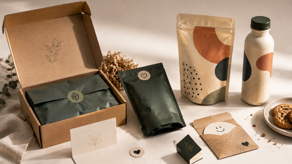
A package designed for children should probably not communicate in the same way as one aimed at health-conscious professionals. A nostalgic product can use very different visual cues from a modern functional food brand.
This sounds obvious, but many food packages still seem designed according to what the brand owner personally likes rather than what the intended customer responds to.
The best packaging begins with questions. Who is picking this up? Where are they buying it? What other products are they comparing it with? What matters to them most: price, taste, health, convenience, indulgence, or something else?
Those answers should influence the design long before the first color is selected.
Also Read: Branding Mistakes That Make Small Businesses Look Generic
Branding Has to Survive Beyond One Package
A successful food brand rarely sells just one product forever. A snack may eventually introduce new flavors. A sauce company might launch different varieties. A beverage brand may expand into several sizes and product categories.
That means the packaging system needs room to grow.
Each new product should feel connected to the original brand while still being easy to distinguish. Colors might help separate flavors. Typography and layouts can create consistency. Illustrations or photography can change while following the same overall visual language.
This is where D2C branding and packaging strategy become connected. The goal isn’t simply to create one attractive package. It is to build a recognizable system that can continue working as the business grows.
Great food packaging has a difficult job. It needs to get noticed in a crowded environment, communicate what the product is, create an emotional or sensory reaction, and make the customer feel confident enough to choose it.
The strongest designs don’t rely on one trick. They understand the product, the shelf, the competition, and the customer. Sometimes that leads to bold colors and dramatic imagery. Sometimes it leads to simplicity. The difference is that the choices are intentional.
In the end, standing out is not really about being louder than everyone else. It’s about giving people a reason to stop, look closer, and think, “That might be worth trying.”
