
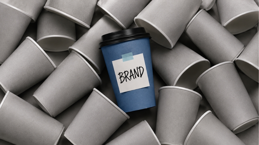
Walk into any busy marketplace and you’ll notice something strange. Dozens of businesses are competing for attention, yet many of them seem to blur together. The same colors appear on their social media pages, the same stock photos show up on their websites, and the same predictable phrases fill their advertisements. As a graphic design company, we’ve seen how easily a small business can fall into this trap. The problem is rarely that the business has nothing interesting to offer. More often, its branding simply fails to communicate what makes it different.
Imagine two coffee shops opening on the same street. One has excellent coffee, friendly staff, and loyal customers, but its Instagram looks like every other café online. Its logo feels ordinary, its menu uses a generic template, and its packaging could belong to any coffee brand. The other shop has a clear personality. You can recognize its colors from across the street, remember its visual style after seeing one post, and immediately understand the kind of experience it offers. The difference isn’t necessarily the quality of the coffee. It’s the strength of the identity surrounding it.
This is where many small businesses misunderstand branding. They think looking professional means looking like everyone else. They choose safe fonts, familiar colors, and popular design styles because they don’t want to make the “wrong” choice. But when every business makes the same safe decisions, the result is predictable. Instead of building recognition, they disappear into a sea of businesses that look almost identical.
Mistake 1: Choosing a Logo Because It Looks Nice
One of the first branding decisions a small business makes is its logo, and this is where many businesses start thinking too narrowly. They search for something attractive, perhaps a stylish font or an interesting icon, and assume that a good-looking logo automatically means good branding.
A professional logo design should do more than look appealing on a presentation screen. It needs to represent the personality of the business, work across different sizes, and remain recognizable when used on a website, social media profile, product, or storefront. The goal isn’t to create the most complicated logo. It’s to create an identity that people can recognize and remember.
Mistake 2: Trying to Look Like the Competition

When a business enters a crowded industry, studying competitors is useful. The problem begins when research turns into imitation. A new skincare brand notices that every competitor uses beige packaging, minimal typography, and soft photography, so it adopts the exact same visual language. The result may look polished, but customers have no reason to remember it.
Good branding requires understanding the category without becoming trapped by it. A business should know what customers expect, but it should also identify opportunities to create distinction. Sometimes that means using a different color palette, a more expressive tone, or a photography style competitors have ignored. Being familiar enough to feel trustworthy while being different enough to be remembered is one of the most valuable balances a brand can achieve.
Mistake 3: Treating Every Design as a Separate Project
A business might have a beautiful logo, a well-designed website, attractive social media posts, and impressive product packaging. Yet when you look at everything together, none of it feels connected. The logo uses one style, the website follows another, and social media looks like it was created by a completely different company.
This happens when businesses treat branding as a collection of individual design tasks instead of one connected system. Strong branding creates consistency across the customer journey, so people feel like they’re interacting with the same business at every stage. Customers may discover a company through Instagram, visit its website, receive an email, and eventually open a package at home. If every touchpoint feels unrelated, the brand becomes harder to recognize and easier to forget.
Also Read: The Secret Behind Scroll-Stopping Visuals
Mistake 4: Using Trends as a Personality
Trends can be useful sources of inspiration, but they become dangerous when they replace a brand’s identity. A business might adopt a popular typeface, trendy gradients, or the latest social media aesthetic simply because other brands are doing it. For a few months, everything looks modern. Then the trend disappears, leaving the business with a visual identity that no longer feels distinctive.
The strongest brands don’t ask, “What design style is popular right now?” They ask, “What should our brand be remembered for?” A trend might influence a design detail, but it shouldn’t determine the entire personality. Businesses that build identities around their own values, audience, and positioning are far more likely to remain recognizable as visual trends change.
Mistake 5: Thinking Professional Means Minimal

Minimalism has become one of the most popular design styles in modern branding. Clean layouts, neutral colors, generous white space, and simple typography can look incredibly sophisticated. The problem is that minimalism has become so common that simply using it doesn’t automatically make a business feel premium or distinctive.
A clean design can still be generic if there is no strong idea behind it. A business can have the most beautifully designed website in its industry and still be forgettable if the visual identity doesn’t communicate anything unique. Professional design isn’t about removing personality in the name of simplicity. It’s about creating clarity while preserving the characteristics that make a brand different.
Mistake 6: Forgetting That Packaging Is Part of the Brand
For businesses selling physical products, the customer experience doesn’t end when someone clicks the checkout button. One of the most important branding moments may happen days later when the order arrives.
Imagine receiving a beautifully designed product in a completely ordinary shipping box. The online experience felt premium, but the physical experience feels disconnected. This is where thoughtful packaging design becomes important. Packaging can reinforce a brand’s personality, create anticipation, and make customers feel that their purchase was worth remembering.
For D2C businesses, this becomes even more significant. D2C packaging design can turn a delivery into a branded experience that customers photograph, share, and associate with the business. A carefully considered package doesn’t just protect what’s inside. It continues the story the brand started online.
Mistake 7: Filling the Website With Generic Language
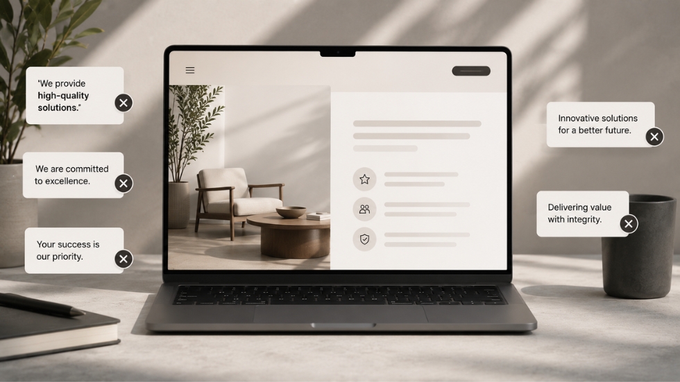
Sometimes a business invests heavily in its visuals but forgets about the words surrounding them. The website looks beautiful, but the copy says things like “We provide high-quality solutions” or “We are committed to excellence.” These statements may sound professional, but they could belong to almost any company.
Your website design and messaging need to work together. Strong visuals might attract attention, but the words should explain why the business deserves it. What does the company do differently? Who is it for? What problem does it solve better than competitors? When a website answers these questions clearly, visitors begin to understand the brand rather than simply admire its appearance.
Mistake 8: Changing Everything Too Often
A small business launches with one logo, changes its colors six months later, redesigns its social media templates the following year, and then decides it needs another new identity because engagement has dropped. Constant changes may feel like progress, but they can make it difficult for customers to build recognition.
Brand recognition depends on repetition. Customers need to encounter familiar visual and verbal signals repeatedly before those signals become associated with the business. This doesn’t mean a brand should never evolve. It means changes should have a reason. A thoughtful evolution strengthens an existing identity, while constant reinvention forces customers to start recognizing the business all over again.
Also Read: Before You Redesign Your Brand, Read This
Mistake 9: Trying to Appeal to Everyone

One of the fastest ways to make a brand feel generic is to make it suitable for everyone. A business wants to appeal to young customers, older customers, budget shoppers, premium buyers, and trend-focused consumers all at once. To avoid excluding anyone, it creates a personality that says very little.
Distinctive brands understand that being relevant to one audience is more valuable than being vaguely appealing to everyone. A clear point of view makes decisions easier. It influences the colors a brand chooses, the language it uses, the photography it selects, and even the way its products are presented. When a business knows exactly who it wants to attract, its branding becomes more confident and specific.
The Real Problem Is Not Being Small
Small businesses sometimes believe they look generic because they don’t have the budgets of larger companies. While resources can influence execution, budget isn’t the only reason a brand becomes forgettable. A business with limited resources can still have a distinctive identity if it knows what it wants to communicate.
The real problem is often a lack of clarity. When a business doesn’t know what makes it different, the branding becomes a collection of safe decisions. When it understands its personality, audience, and position, those decisions become much easier. The colors have a reason. The logo has a purpose. The packaging feels intentional. The website sounds like a real business rather than a template.
Looking professional and looking generic are not the same thing. A brand can have polished visuals, an attractive website, and beautifully designed materials while still being completely forgettable. The difference lies in whether those elements communicate a clear identity that customers can recognize and connect with.
The strongest small businesses don’t try to look bigger by copying what established brands are already doing. They build identities that reflect who they are, understand who they serve, and remain consistent long enough for recognition to develop. Whether it’s a logo, a social media post, a website, or a package arriving at someone’s doorstep, every interaction is another opportunity to become memorable.
Great branding doesn’t require a business to shout louder than everyone else. It requires the courage to stop blending in.
