

A website design can look impressive and still leave customers wondering what to do next. Picture someone visiting your website because they’re genuinely interested in what you sell. They find a page that looks polished, but the menu is confusing, important information is buried, and the button they need is nowhere obvious. After a few frustrated clicks, they leave. From the business owner’s perspective, nothing appears broken. From the customer’s perspective, the website simply made things harder than they needed to be.
That is where user experience, or UX, comes in. UX isn’t just about making websites look clean or modern. It is about understanding what people are trying to accomplish and removing the unnecessary obstacles between them and that goal. Whether someone is trying to buy a product, book an appointment, find an answer, or contact your team, every step affects how they feel about your business.
You don’t need to become a UX designer to understand the fundamentals. But knowing a few important principles can completely change the way you look at your website, online store, app, or even physical customer experience.
Start With What the Customer Wants to Do
Business owners naturally think about what they want customers to see. They want people to notice their products, read about their services, learn about the company, and eventually make a purchase. Customers approach the experience differently. They usually arrive with something specific in mind, and they want to accomplish it without unnecessary effort.
Someone visiting a restaurant website might simply want to see the menu. A potential client may want to understand your pricing. Someone who has already purchased might only be looking for your return policy. If every visitor has to navigate through several unrelated pages before finding what they need, the experience becomes frustrating.
Good UX starts by putting the customer’s goal ahead of the company’s desire to show everything at once. The more clearly you understand what visitors are trying to accomplish, the easier it becomes to design an experience around those needs.
Make Important Things Easy to Find
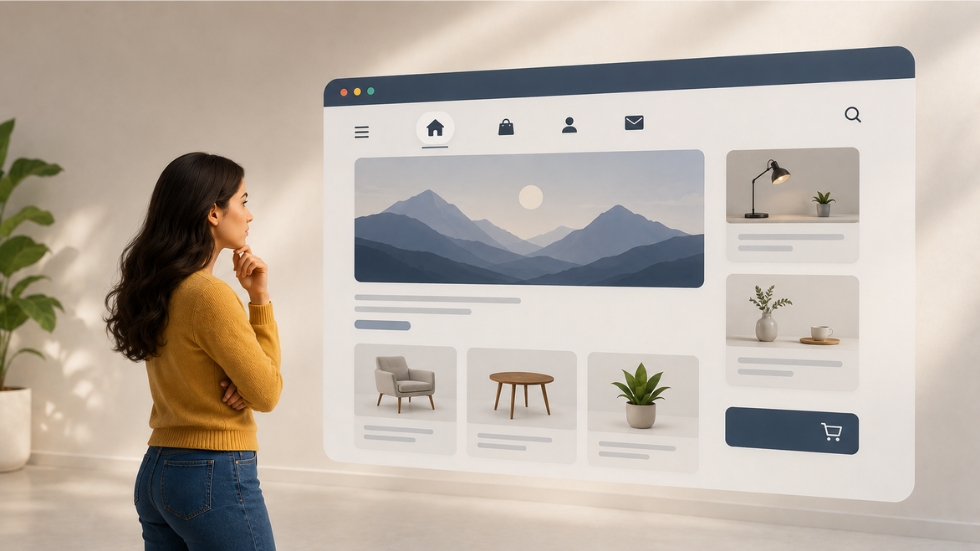
One of the simplest UX principles is also one of the easiest to ignore: don’t make people search for information that matters.
Imagine walking into a physical store where the signs are tiny, products are arranged randomly, and there is no indication of where anything belongs. You would probably leave fairly quickly. Websites work the same way, even though the environment is digital.
Navigation should feel predictable. Important information should appear where people expect to find it. Buttons should be easy to recognize, headings should explain what each section is about, and visitors shouldn’t have to guess what happens when they click something.
This doesn’t mean every element needs to be oversized or brightly colored. It means the design should establish a clear hierarchy so people can quickly understand what deserves their attention.
Don’t Make People Think Harder Than Necessary
A customer shouldn’t need to solve a puzzle every time they use your website.
Consider a checkout page asking for information in an unusual order, using unfamiliar labels, or displaying several confusing options at once. Nothing may technically be broken, but the customer has to stop and figure out what the website wants from them. Every one of those moments creates friction.
Good UX reduces unnecessary thinking. Familiar icons, straightforward labels, recognizable navigation patterns, and simple instructions allow people to move through an experience without constantly questioning whether they’re doing something correctly.
This is particularly important for businesses selling online. When customers have to think too hard about how to purchase something, complete a form, or find an answer, there is always a chance they’ll decide it isn’t worth the effort.
Also Read: Why Your CTA Isn’t Getting Clicks
Consistency Makes Experiences Easier
Imagine clicking from one page of a website to another and suddenly finding that the navigation has changed, buttons look completely different, and familiar actions have moved somewhere else. Even if each individual page looks attractive, the overall experience feels unreliable.
Consistency helps people learn how your interface works. When buttons behave similarly, navigation stays predictable, and visual patterns remain familiar, users don’t have to relearn the website on every page.
This is one reason logo design and broader visual identity matter to UX too. A recognizable visual system creates familiarity, but that system should extend beyond the logo. Typography, colors, spacing, buttons, icons, and layouts should work together so the experience feels like one connected environment.
Design for the First-Time Visitor
Business owners often know their websites too well.
You’ve probably visited your own website hundreds of times. You know where everything is, which button leads to which page, and what certain terms mean. A first-time visitor doesn’t have that knowledge.
That difference can reveal problems that are almost invisible to the people running the business. A menu item might make perfect sense internally but be unclear to a customer. An industry term might feel obvious to your team but confusing to someone discovering your business for the first time.
This is why testing with people who aren’t familiar with the business can be so useful. Watch where they hesitate. Notice what they overlook. Pay attention to the questions they ask. Those moments often reveal more about UX problems than another round of internal opinions.
Also Read: The Secret Behind Scroll-Stopping Visuals
Every Extra Step Has a Cost
Businesses sometimes add steps because each one seems harmless. Maybe customers need to create an account before purchasing, click through another page to see pricing, or complete a long form before requesting a consultation.
Individually, these decisions might not seem serious. Together, they can create enough friction to make someone abandon the process.
This doesn’t mean every customer journey should be reduced to one click. Some processes naturally require more information or verification. The important question is whether every step has a clear purpose.
If a customer has to do something, there should be a good reason for it. Otherwise, you’re asking them to spend effort that may not be necessary.
Good UX Includes Accessibility
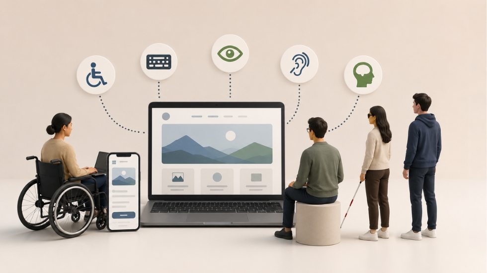
A website can be easy for one person to use and surprisingly difficult for another. Small design decisions can make a major difference for people with different abilities, devices, or browsing conditions.
Readable text, sufficient contrast, descriptive labels, logical headings, keyboard-friendly interactions, and meaningful alternative text are examples of considerations that can make digital experiences more accessible.
Accessibility isn’t simply about satisfying a technical requirement. It is about making sure more people can actually use what you’ve built.
For a business, that also makes practical sense. If customers cannot comfortably read your content, navigate your website, or understand important information, you’ve created a barrier between them and your offering.
UX Doesn’t Stop at the Website
It is easy to think of UX as something that belongs exclusively to websites and apps. In reality, customers experience a business as one connected journey.
They might discover you through social media, visit your website, purchase a product, receive an email confirmation, contact customer support, and eventually receive their order. Every interaction influences their perception.
This is especially important for businesses investing in D2C Branding. When there is no physical store bringing the experience together, digital and physical touchpoints need to feel connected. Even D2C packaging design can contribute to that journey by making the final stage of the purchase feel clear, thoughtful, and consistent with everything that came before it.
Good UX Is Also About What You Remove
There is a common temptation to keep adding features. More filters, more animations, more pop-ups, more options, more information. But every addition creates another decision for the customer.
Sometimes the smartest UX improvement is removing something.
A confusing menu can become simpler. A long form can be shortened. A distracting pop-up can disappear. A page filled with competing messages can be reduced to one clear next step. Good UX isn’t about adding as much as possible. It is about giving people what they need without surrounding it with unnecessary noise.
This principle applies to physical experiences too. A thoughtful packaging design company considers how easily customers can understand and interact with a package, not simply how attractive it looks.
Measure What People Actually Do

UX decisions shouldn’t rely entirely on personal preference. You might think a particular layout looks better, but customers may behave differently.
Look at where visitors leave your website, which pages receive the most attention, where users abandon forms, what products are viewed most often, and which pages lead to conversions. Heatmaps, analytics, recordings, surveys, and usability testing can all reveal useful patterns.
You don’t need a complicated research department to start learning from customer behavior. Even a few observations can challenge assumptions that seemed obvious internally.
The best UX decisions come from combining design knowledge with evidence about what people actually do.
Good UX isn’t about making every website look minimal or following a checklist of trendy design rules. It is about making the experience feel natural from the customer’s point of view.
People should be able to understand where they are, find what they need, know what to do next, and complete their goal without unnecessary frustration. The visual side still matters, but it should support usability rather than compete with it.
For business owners, understanding UX means learning to look at your digital experience differently. Instead of asking, “Does this look good?” start asking, “Would this make sense to someone seeing it for the first time?” That simple shift can uncover problems your team has become too familiar with to notice.
