
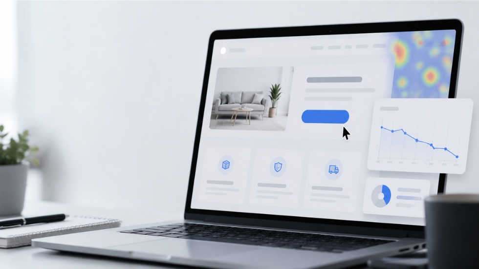
You’ve spent hours working on your website design. The homepage looks polished, the images are carefully selected, the offer seems attractive, and you’ve placed a clear call-to-action exactly where visitors should see it. Yet when you check your analytics, something doesn’t add up. People are visiting the page, scrolling through your content, and perhaps even spending several minutes exploring the site, but almost nobody is clicking the button you’ve carefully designed for them.
This is where many businesses make the same mistake. They assume the CTA itself must be the problem. Maybe the button needs a brighter color. Perhaps “Buy Now” should become “Get Started.” Maybe the font needs to be larger or the button should be moved higher on the page. These details can matter, but a weak CTA is rarely just a button problem. More often, the real issue begins much earlier, with everything that happens before the visitor reaches that moment of decision.
A call-to-action can only work when the person seeing it has a reason to act. If the value isn’t clear, the offer doesn’t feel relevant, or the customer isn’t ready, even the most beautifully designed button will struggle to generate clicks. Understanding why people hesitate is the first step toward creating CTAs that actually move them forward.
Your CTA Might Be Asking Too Much Too Soon
Imagine walking into a shop you’ve never visited before. Before you’ve had a chance to look around, a salesperson approaches you and immediately asks you to make a large purchase. Even if the product is excellent, you might hesitate because you haven’t built enough confidence yet. You don’t know enough about the business, the product, or the person asking you to buy.
Online customers behave in much the same way. Someone visiting your website for the first time may not be ready to purchase immediately. They might still be comparing options, learning about the product, or deciding whether they can trust the business. Asking them to “Buy Now” before answering those questions can create resistance instead of action.
Not every visitor needs the same CTA. Someone discovering your brand for the first time may respond better to “Explore the Collection” or “See How It Works,” while someone who has already viewed a product several times may be ready for “Get Yours Today.” The most effective calls-to-action match the customer’s level of awareness instead of forcing every visitor into the same step.
A Button Cannot Fix an Unclear Offer
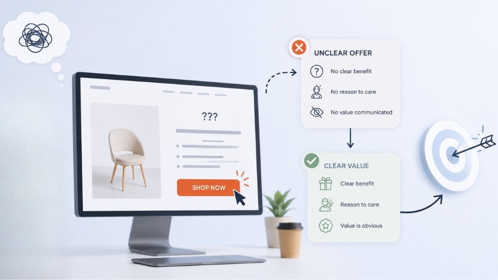
Sometimes businesses spend far too much time debating the wording of a CTA when the real problem is the offer itself. Changing “Shop Now” to “Start Shopping” won’t suddenly make people click if they don’t understand why they should care about the product or what makes it worth their attention.
Before asking visitors to take action, your page needs to answer a simple question: What do they get if they click? The answer doesn’t always have to be a discount or a physical product. It could be access to useful information, a solution to a problem, a free consultation, or a simpler way to accomplish something they already want to do.
A strong CTA is the final step in a convincing argument. If the content surrounding it hasn’t created enough interest or communicated a clear benefit, the button has very little power on its own. The visitor needs to understand the value before they’re willing to take the next step.
Generic Words Create Generic Results
“Click Here.” “Submit.” “Learn More.” “Get Started.” These phrases aren’t necessarily wrong, but they often fail to give visitors a compelling reason to take action. They describe what the button does without explaining why the person should care about doing it.
Compare “Learn More” with “See How We Can Improve Your Store.” The second CTA gives the visitor a clearer idea of what happens next and why the action might be useful. The difference is small, but the underlying thinking is important. Good CTA copy focuses on the outcome rather than simply describing the action.
Instead of asking someone to “Download,” tell them what they’re getting. Instead of “Book a Call,” explain the benefit of having that conversation. The more clearly a CTA connects the action to a desired result, the easier it becomes for people to understand why they should click.
Your CTA May Be Competing With Everything Else
Think about a website where every section seems to demand your attention. There’s a pop-up offering a discount, a floating chat window, a newsletter form, several promotional banners, social media icons, and multiple buttons pointing in completely different directions. The visitor may have plenty of opportunities to click, but ironically, the abundance of choices can make it harder to decide what to do.
This is where visual hierarchy becomes important. Good design doesn’t simply place CTAs everywhere. It creates a clear path through the page and makes the most important action visually obvious. If every button has the same size, color, and importance, nothing feels important.
Your primary CTA should have enough visual distinction to stand out, while secondary actions should support the customer journey without competing for attention. The principles of effective logo design apply in a similar way. Every element needs a purpose, and visual decisions should help people understand what matters rather than creating unnecessary noise.
Also Read: The Secret Behind Scroll-Stopping Visuals
The CTA Might Be Appearing at the Wrong Moment
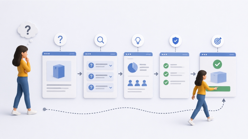
Timing can make or break a CTA. A visitor might be interested in your product but still need more information before they’re ready to act. If the CTA appears before you’ve answered their questions, it may feel premature.
Imagine reading about a completely unfamiliar service and immediately being asked to schedule a consultation. You might want to understand the process first. What does it cost? Who is it for? What results can you expect? What happens after you book? These questions create friction when they’re left unanswered.
Strong pages anticipate these concerns before presenting the final CTA. The content builds understanding first, reduces uncertainty next, and then asks the visitor to take action. The CTA feels natural because the page has prepared the person for that decision rather than interrupting them with a request they aren’t ready to make.
Trust Issues Can Kill Good CTAs
Sometimes people aren’t clicking because they don’t trust what will happen after they do. This is particularly common when the CTA involves sharing personal information, making a payment, or committing to a service. Even when visitors are interested, uncertainty can stop them from moving forward.
A visitor might wonder whether they’ll receive unwanted emails, whether their payment information is secure, or whether they’ll be pressured into buying something they don’t want. These concerns may never appear in a survey or customer message, but they can still influence behavior.
Trust signals help reduce that hesitation. Customer reviews, testimonials, guarantees, transparent pricing, secure payment indicators, clear policies, and straightforward explanations all make the next step feel safer. A professional packaging design company, for example, understands that customers judge a product experience through many small details. The same principle applies online. Every detail contributes to whether a visitor feels confident enough to act.
Your CTA May Not Match Your Brand
A CTA doesn’t exist separately from the brand surrounding it. The language, tone, design, and overall presentation should feel like a natural part of the customer experience.
A luxury brand using aggressive phrases like “HURRY! BUY NOW!” may create a disconnect if the rest of the experience feels calm and sophisticated. Similarly, a playful brand using overly formal language may suddenly feel unfamiliar at the exact moment it asks customers to act.
This is where D2C Branding becomes especially important. When the visual identity, messaging, product experience, and CTA all feel connected, customers develop a stronger sense of familiarity. The button doesn’t feel like an interruption. It feels like the natural next step in the relationship the brand has been building.
Also Read: Branding Mistakes That Make Small Businesses Look Generic
Sometimes the Problem Is the Page, Not the CTA
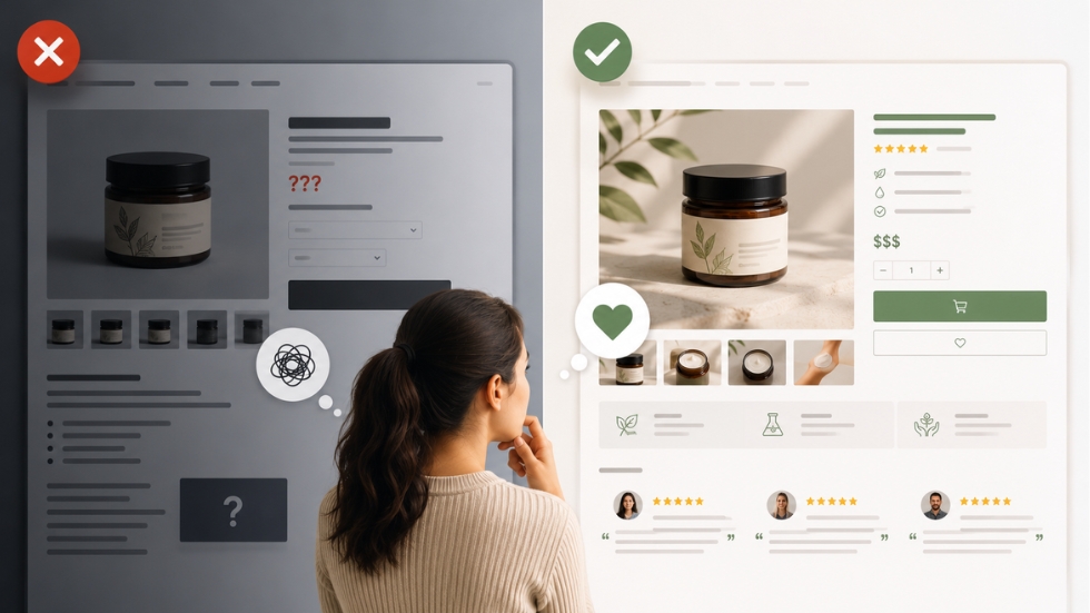
It’s easy to focus on the button because it’s the most obvious part of the conversion process. But if the page has a confusing layout, weak messaging, poor product photography, or too much information, the CTA may simply be the final symptom of a larger problem.
Consider a product page with beautiful packaging design but unclear pricing, missing product details, and no customer reviews. The packaging may attract attention, but the visitor still won’t feel confident enough to purchase. Every part of the experience contributes to conversion.
This is why a graphic design company often looks beyond individual visuals when helping a business communicate more effectively. Your logo, imagery, content, page structure, and even the way your product is presented influence how trustworthy the business feels. A CTA works best when everything around it has already done its job.
The Best CTA Is Often the One That Feels Obvious
The strongest calls-to-action don’t always feel clever or revolutionary. They simply appear at the right moment, communicate a clear benefit, and make the next step feel easy.
Think about the last time you clicked a button without giving it much thought. You probably didn’t stop to analyze its color or debate the exact wording. You clicked because you already knew what you wanted to do and the button made that action simple.
That’s the real goal of a good CTA. It shouldn’t force people into action. It should remove uncertainty around the action they already want to take. The best conversion experiences make the next step feel so natural that visitors barely need to think about it.
The Experience Around the CTA Matters Too
For D2C businesses, the customer journey doesn’t stop at the click. The experience that follows can influence whether someone becomes a repeat customer or disappears after one purchase. This is where D2C packaging design can become part of a much larger conversion strategy.
Imagine a customer who discovers a brand through social media, visits its website, clicks a CTA, completes a purchase, and then receives an order beautifully presented in packaging that feels consistent with everything they experienced online. Each touchpoint reinforces the same message and builds confidence in the brand.
The opposite is also true. If the online experience feels premium but the product arrives in generic packaging with no attention to detail, the customer’s perception can change instantly. Conversion isn’t just about getting the first click. It’s about creating an experience that makes customers feel confident about choosing your business again.
Test the Journey, Not Just the Button
Businesses often test CTA colors, button sizes, and different phrases, which can be useful. But optimizing conversions requires looking at the entire customer journey rather than treating the CTA as an isolated element.
Ask yourself what happens before the click. Does the visitor understand the offer? Do they trust the business? Have their questions been answered? Is the next step clear? Does the page make the decision feel easy?
Once you start thinking about the journey instead of just the button, conversion optimization becomes much more strategic. The goal isn’t to trick someone into clicking. It’s to create an experience where clicking feels like the obvious next move.
A CTA that isn’t getting clicks isn’t necessarily a bad CTA. The problem could be unclear messaging, weak positioning, poor timing, too many distractions, or a lack of trust. Sometimes the button is perfectly fine. The page simply hasn’t given the visitor enough reasons to use it.
The most effective CTAs work because everything around them supports the decision. The message creates interest, the design guides attention, the content builds confidence, and the CTA provides a clear next step. When these elements work together, clicking no longer feels like a decision that requires effort.
Before changing the color of your button or rewriting the words for the tenth time, step back and look at the entire customer journey. Ask whether you’ve earned the click before asking for it. Because when people understand the value, trust the brand, and know exactly what happens next, the right CTA doesn’t have to fight for attention. It simply makes the next step obvious.
